Outdoor Apparel Company Redesign Concept
Roles: User Experience, Visual Design
Shift7 Digital (formerly Siteworx)
The design team at Shift7 Digital (formerly Siteworx) was often tasked with creating visual concepts for prospective clients in order to win work. An outdoor apparel company was looking to redesign their web presence, with the important goal of rearchitecting their site in a user-focused way. To go along with this user experience thinking, I helped put together one of the three visual concepts that our team put forward in the pitch.
Mood boarding and Design Direction
In general, the prospective client has a recognizable name and brand in the marketplace, but this specific unit for outdoor clothing and gear is less widely known. We also knew that the business unit we were pitching to was open to seeing new branding and digital design direction ideas for the line of apparel.
Mood boards
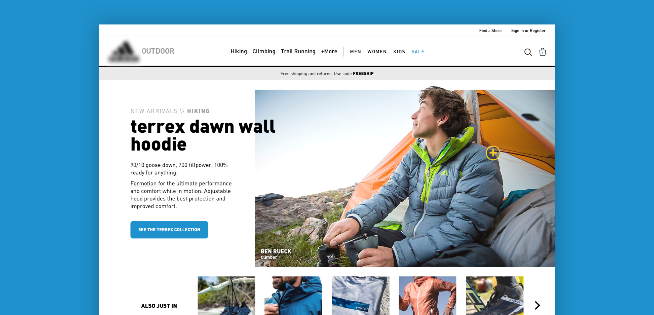
After a few iterations, I narrowed my focus on dramatic athletic imagery with sweeping landscapes, bright colors, and interactive elements that turned normal catalog-like images into useful components in an e-commerce experience.
Initial Site Architecture Concepts
Our team also knew that site structure and categorization was extremely important to the pitch. I brainstormed multiple ways to categorize the company's products, varying from many specific top-level items, to just a few sweeping categories. These various concepts would ultimately drive the concept I was working on.
Final Site Architecture Design
I finally narrowed down the navigational structure to three popular activities, with the option to view more, as well as categories by gender and age. Finally, each gender or age main category would have a mega-navigation view that allows for users to drill down to specific items, with room for a targeted marketing promo.
Color Composites and Animations
The visual design parameters for the pitch were to create a landing page and a product detail page. Each of these pages included ways to bring in user generated content, whether in the form of social media or product reviews.
Landing page color composite
Landing page and Product Detail page color composites
Product Detail page color composite
I also took my landing page concept a step further by animating what traditional marketing content could look like as an enhanced e-commerce experience. Images with a "+" icon can be clicked to view the product "add to cart" information, so that the user can quickly and easily click through to the full product detail page, or simply set their specs and add the product immediately to their cart.
Add To Cart animation

Resume
Dribbble Profile