Katie George Macrame
Roles: Branding, Print Design
My best friend, Katie George, reached out to me to help her create a brand for her not-so-new macrame side hustle. She had already brainstormed a general vibe for her brand, but she wanted me to help her figure out her brand and logo mark to use across the web and on physical materials related to her business–including new business cards that she also wanted me to design.
Sketching & Concepting
Katie came to me with two thoughts already–she wanted her initials, and she really liked serif fonts. So, I started with pen to paper and get some ideas flowing. I kept coming back to the idea of connecting the "k" and "g" lowercase glyphs together to create a cohesive symbol, with just the right amount of positive and negative space to create an interesting logo.
Bringing the logo to life digitally meant deciding on typefaces. I used Halant as a basis for the "kg" portion of the logo, and landed on DIN for the "Katie George Macrame" tagline.
I played around with various ways to take the "kg" symbol further. What about a round background? Dark colors? Light colors? And what about including a horizontal version that really amplifies "Katie George Macrame"?
KG Macrame Instagram profile
Katie was thrilled with my ideas and sketches. She quickly identified that the "kg" symbol on the light gray circle background should be her social media profile picture.
(Pro-tip, if you look above, you'll see Katie's smiling face!)
Playing With Color
To this point, I was still only playing with whites, blacks, and grays. Katie's brand, and even her macrame creations however, are more colorful than that. When I asked her about color, she mentioned she's been toying with olive green and light pink as a color combination. I decided to work with that as inspiration for a color palette of options that expands beyond that.
Katie was very happy with all of her final colors, giving her plenty of flexibility to evolve her brand over time, and over all the digital and physical products she may need to make in the future.
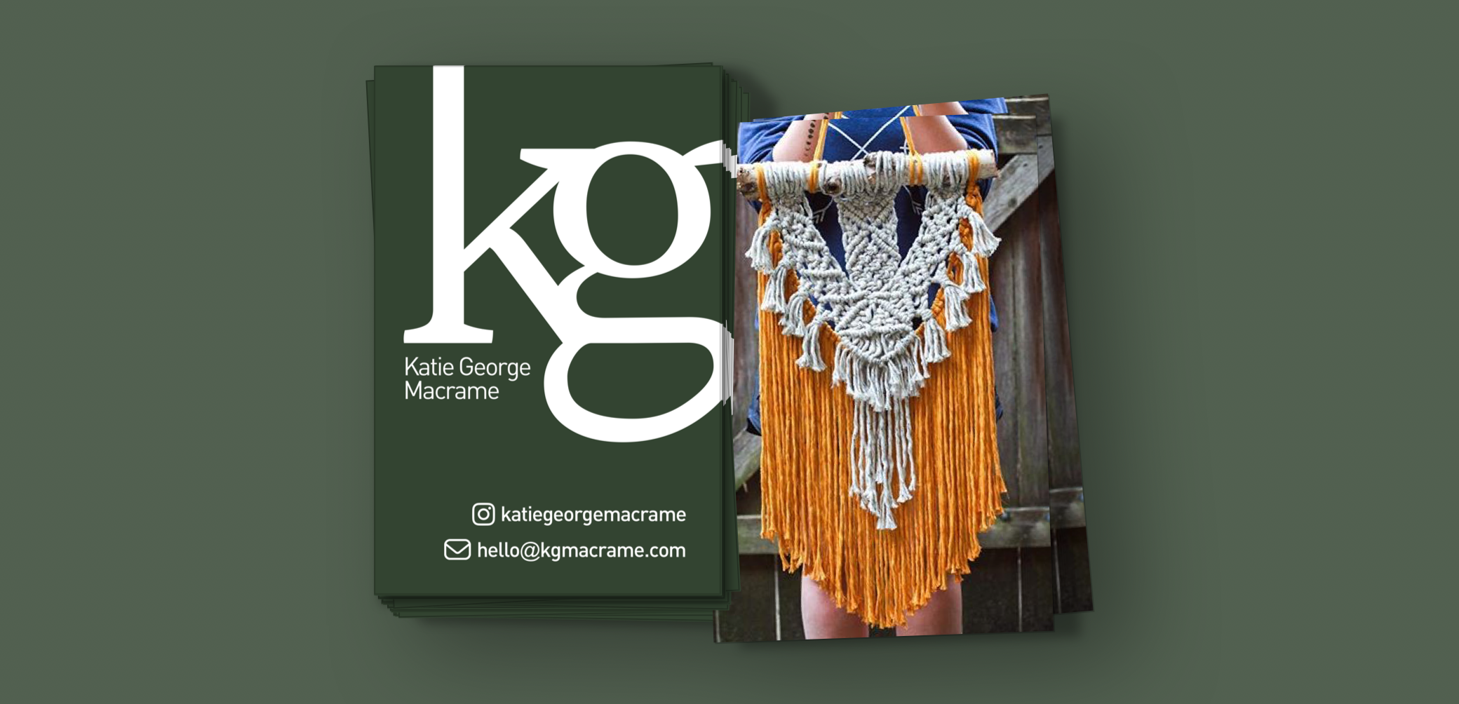
Business Cards
Of all the colors, she was most drawn to the dark olive green. Thus, we moved forward with that as our direction for a business card design. Her requirements were to keep it super simple, and include her two main points of contact–Instagram and email. And finally, for the back, she chose a colorful, high quality, photo of one of her best creations. This business card truly lets the work speak for itself!
KG Macrame business card
Since creating this brand look and feel, Katie has rebranded. She has a whole new name, Seven of Swords Fiber Art, and look to encapsulate her move into fiber arts more generally than just focusing on macrame. Check out her instagram!

Resume
Dribbble Profile